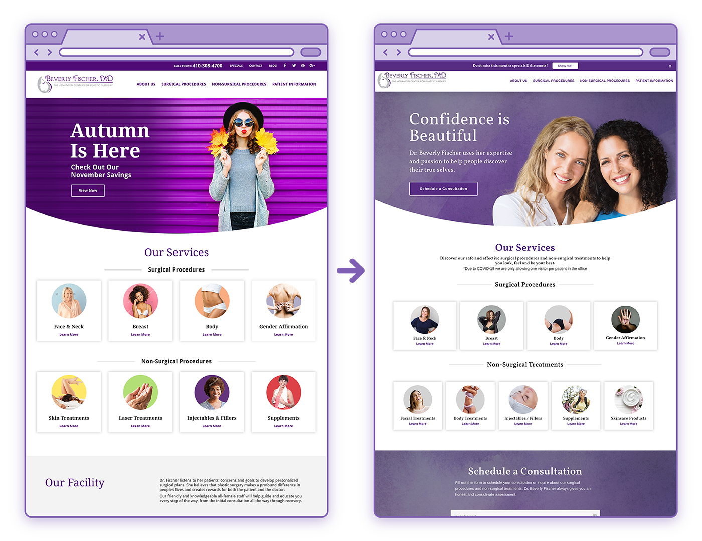
Dr. Beverly Fischer Website Design and Development
It was a pleasure to reimagine and redesign the website for a longtime Ironmark client, Dr. Beverly Fischer, in the spring of 2019. Her previous website for the Advanced Center for Plastic Surgery gave our team a great launching point in terms of content, branding, and imagery. The need for reorganization was clear, however, as the homepage only highlighted a few of Dr. Fischer’s many services and treatments, and there was also a need for improved navigation.
Key project features:
Designed in Adobe Photoshop
Developed in HubSpot
Custom, restructured mega menu for desktop and mobile
The very first mockup of the redesigned homepage was created in the fall of 2017, but the client wasn’t quite ready to begin an entire website redesign at that time. Instead, the project went into hibernation until early 2018, when we utilized the initial homepage design to create a new, standalone landing page for the launch of Dr. Fischer’s UpLyft marketing campaign.
Much of the branding and design that went into the UpLyft campaign became the foundation for the rest of Dr. Fischer’s site once the full redesign began in 2019. Purple plays a major role in much of Dr. Fischer’s marketing, and her website is no exception. Textured backgrounds were used to provide interest in what otherwise would have been flat color blocks. I also chose a number of floral graphics to use as section headers and testimonial backdrops, as flowers and fruits are often used in Dr. Fischer’s marketing as a representation for the female figure. These graphics complemented the happy, confident women shown throughout the website.
To see the full site, visit beverlyfischer.net.
Website Design Progression: A comparison between where Dr. Fisher’s site began prior to the redesign (left), my first landing page creation for the UpLyft campaign (middle), and the final homepage (right).
Design to Development: Final Photoshop design mockup (left) compared to the final, live website on HubSpot (right).
User Pathway: A look at the rest of the homepage (left), plus a dive into one potential visitor pathway through the website, from the Face & Neck Procedures category page (middle) to the Facelift services page (right).


