ABWM Foundation Website Design
The American Board of Wound Management (ABWM) and ABWM Foundation were both in need of a website refresh, and they approached Ironmark to tackle each site in separate phases. I had the opportunity to design the look of the new ABWM Foundation site, where wound care industry professionals can find resources to help them complete ABWM certifications and continue their education.
Key project features:
Designed in Adobe Photoshop
An above-the-fold homepage layout
A customized icon set for the resource library
Knowing that the new website would be based in WordPress, we selected a theme that would allow us to build a fresh, more modern site and remove the clutter of the previous design. ABWM Foundation is focused on getting their certification materials to those who need them, and it was important to make the path to those as resources streamlined as possible.
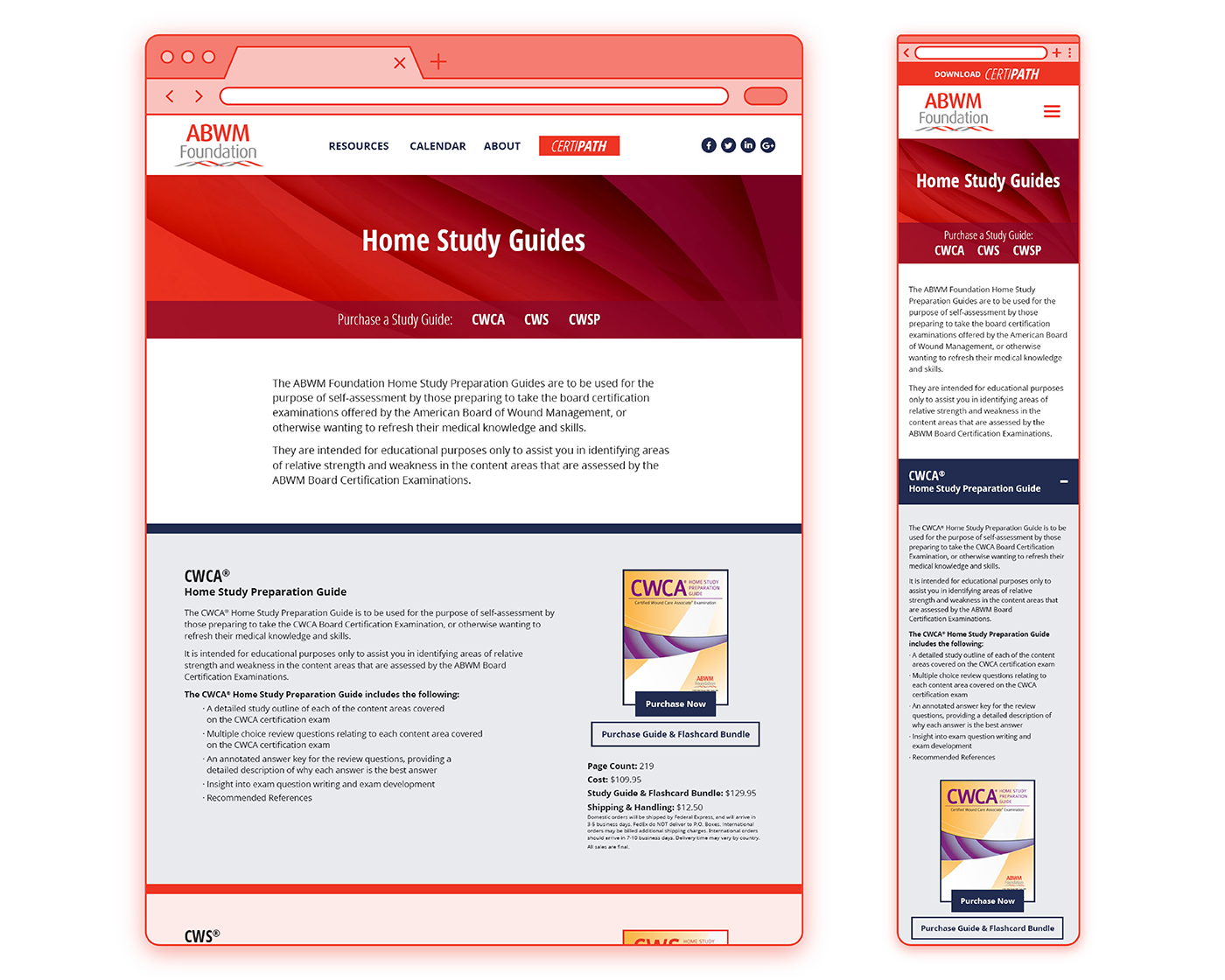
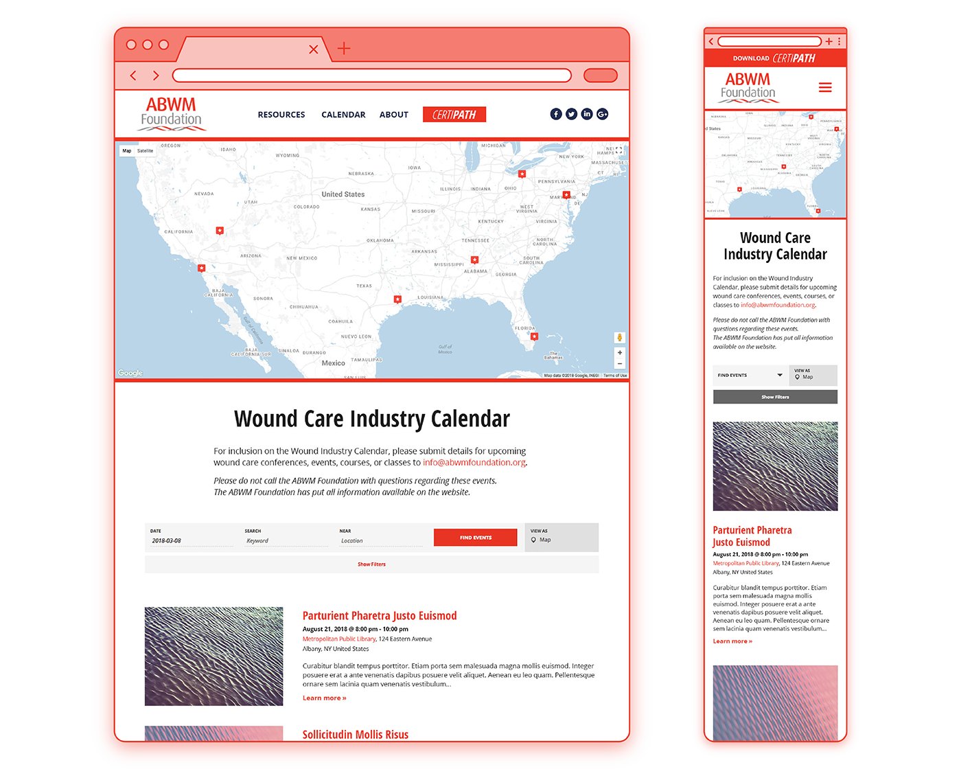
To start, the homepage design was simplified, and was now comprised of a shorter navigation menu, a large hero slider, and four large text boxes linking to the client’s four key certification materials. Interior pages still had plenty of content to display, so it was important to me that these pages had wide enough margins and padding to give everything more breathing room and improve legibility.
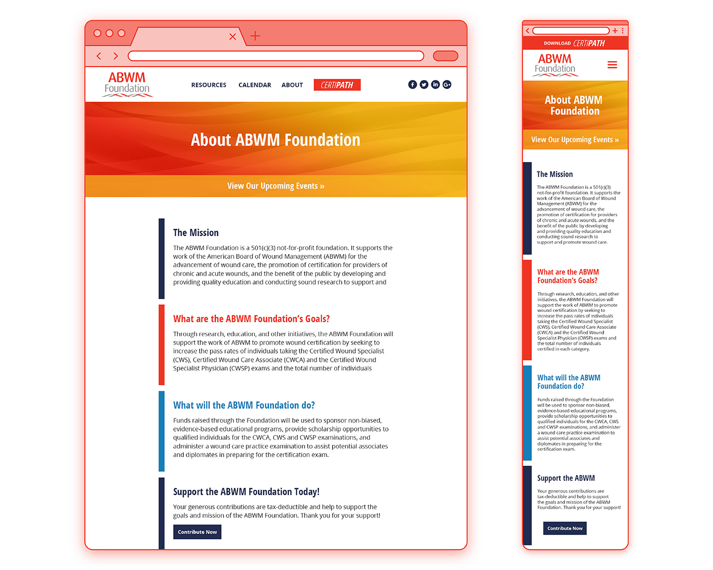
I loved the bold use of color and the abstract textures found on the client’s previous website, and I brought similar elements into the new design. Abstract backgrounds and bright gradients now colored the interior page headers, and the ABWM Foundation color palette served as section dividers, buttons, and other ornamentation.
To see the full site, visit abwmfoundation.org.
Homepage Desktop and Mobile Mockups: My favorite of the two homepage designs displayed a new set of resource icons which were customized specifically for ABWM. These page designs also featured a hero slider and two options for the navigation menu‘s color palette.
Website Design Progression: The original ABWM Foundation website prior to the redesign (top), compared to my homepage design (middle), and the final homepage on WordPress (bottom).


